유튜브 화면의 구성을 구현해보는 예제를 작성해봅니다.
유튜브 화면 구성 모델링
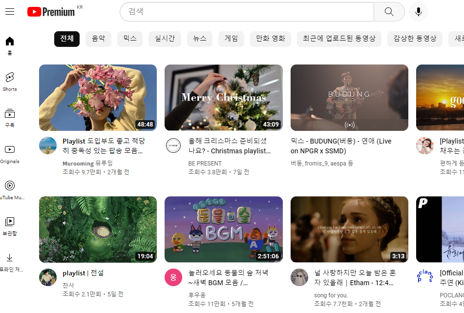
유뷰트 홈 화면을 구현하기에 앞서 간단하게 홈의 세 부분을 나누어볼 수 있어요.
이렇게 세 개의 html 을 작성해서 하나의 html 으로 만드는 작업을 합니다.
| 메 뉴 창 |
헤더 |
콘텐츠 바디 |
시작하기에 앞서웹 브라우저에서 기본적으로 주는 스타일이 있습니다.
우리는 반응형 웹 사이트로 브라우저의 기본 스타일을 적용하는 것을 배제해서 직접 설정해주도록 할 것이기 때문에
설정되어 있는 것을 초기화 clear 해주어야 합니다.
<헤더의 head> 작성
reset.css
reset.css는 브라우저의 기본 스타일을 삭제하기 위해 사용하는 css 입니다.
에릭 마이어의 reset css를 사용하면, 기존 사용하던 브라우저의 스타일을 삭제할 수 있습니다.
https://meyerweb.com/eric/tools/css/reset/
CSS Tools: Reset CSS
CSS Tools: Reset CSS The goal of a reset stylesheet is to reduce browser inconsistencies in things like default line heights, margins and font sizes of headings, and so on. The general reasoning behind this was discussed in a May 2007 post, if you're inter
meyerweb.com
이 홈페이지에 있는 css를 참고하시면 됩니다.
현재 css는 박스 사이즈를 border-box (요소가 커지지 않도록) 로 바꾸고 아웃라인을 삭제했습니다.
reset.css
/* http://meyerweb.com/eric/tools/css/reset/
   v2.0 | 20110126
   License: none (public domain)
*/

html, body, div, span, applet, object, iframe,
h1, h2, h3, h4, h5, h6, p, blockquote, pre,
a, abbr, acronym, address, big, cite, code,
del, dfn, em, img, ins, kbd, q, s, samp,
small, strike, strong, sub, sup, tt, var,
b, u, i, center,
dl, dt, dd, ol, ul, li,
fieldset, form, label, legend,
table, caption, tbody, tfoot, thead, tr, th, td,
article, aside, canvas, details, embed,
figure, figcaption, footer, header, hgroup,
menu, nav, output, ruby, section, summary,
time, mark, audio, video {
	margin: 0;
	padding: 0;
	border: 0;
	font-size: 100%;
	font: inherit;
	vertical-align: baseline;
}
/* HTML5 display-role reset for older browsers */
article, aside, details, figcaption, figure,
footer, header, hgroup, menu, nav, section {
	display: block;
}
body {
	line-height: 1;
}
ol, ul {
	list-style: none;
}
blockquote, q {
	quotes: none;
}
blockquote:before, blockquote:after,
q:before, q:after {
	content: '';
	content: none;
}
table {
	border-collapse: collapse;
	border-spacing: 0;
}

/* 개인적으로 조금 더 추가 */
*{
	box-sizing: border-box;
	outline: none;
}
헤더의 스타일에 들어갈 내용에는 위 css 코드가 들어가야 합니다.
같은 폴더 내에 css 폴더를 만들어 주고 reset.css 링크를 헤더에 걸어줄게요.
그리고 body 에 작성될 컨테이너들에 대한 스타일을 구현하기 위해 스타일 시트를 추가로 작성하여 걸어둡니다.
아래에 작성한 css 스타일 시트는 하나씩 같이 작성해 볼 거예요.
.header{
  position: fixed;
  top: 0;
  left: 0;
  width: 100%;
  background-color: #fff;
  box-shadow: 0 0 3px #000;
  z-index: 20;
}
.header__wrapper{
  display: flex;
  align-items: center;
  justify-content: space-between;
  height: 60px;
  padding: 0 16px;
}
.header__start{
  height: 40px;
  line-height: 40px;
}
.header__hamburger{
  border: none;
  background-color: transparent;
  font-size: 1.5rem;
}
.header__title{
  font-size: 1.2rem;
  margin-left: 6px;
}

.header__center{
  width: 50%;
}
.header__form{
  display: flex;
  max-width: 100%;
}
.header__input--text{
  width: calc(100% - 60px);
  height: 40px;
  padding: 0 6px;
  border: 1px solid #8f8f8f;
  border-right: none;
  border-radius: 2px 0 0 2px;
}
.header__input--button{
  width: 60px;
  height: 40px;
  border: 1px solid #8f8f8f;
  border-left: none;
  border-radius: 0 2px 2px 0;
}

.header__end{
  display: flex;
}
.header__search{
  display: none;
  margin-right: 5px;
  border: none;
  background-color: transparent;
  font-size: 1.5rem;
}
.header__profile{
  width: 40px;
  height: 40px;
  border: 1px solid #eaeaea;
  border-radius: 50%;
  background-color: tomato;
  /* background-image: url(../imgs/1.png);
  background-size: 40px 40px; */
}

@media screen and (max-width: 800px){
  .header__title{
    display: none;
  }
}

@media screen and (max-width: 400px){
  .header__center{
    display: none;
  }
  .header__search{
    display: block;
  }
}
이제 이 두 개의 css를 html 의 헤드에 링크로 연결합니다.
<title>반응형 컴포넌트</title>

  <link href="css/reset.css" rel="stylesheet">
   <link href="css/header.css" rel="stylesheet">
<헤더의 body 작성>
헤더의 자식 요소들을 생성할 때에는 h1, h2 으로 사용하고 class 명을 헤더에서 어떤 역할을 맡고 있는지를 적어주는 것이 좋습니다. 이렇게 클래스명에 어떤 기능을 명시할 때 언더바 두 개를 추가하는데 이것을 BEM 방식이라고 합니다.
BEM은 가독성을 고려한 CSS 방식의 명명규칙입니다.
우선 헤더의 작성을 시작해볼게요.
<html>
<header class="header">
    <div class="header__wrapper">
      <h1 class="header__start">
<div class="header__wrapper"> 를 추가한 이유는 레이아웃을 수월하게 만들기 위함입니다.
헤더 래퍼는 헤더 안에서 실제 표시되는 요소들을 따로 묶어줍니다. 여백을 양쪽으로 추가하기 때문에 여백으로 윤곽을 주기 수월합니다. margin 을 사용하면 다른 요소들과의 겹침현상이 있을 수 있기 때문에 wrapper를 사용합니다.
헤더의 요소들을 묶을 컨테이너를 만들어주었어요.
css에 작성한 내용은 다음과 같습니다.
<css>
.header{
  position: fixed;
  top: 0;
  left: 0;
  width: 100%;
  background-color: #fff;
  box-shadow: 0 0 3px #000;
  z-index: 20;
}
우선 헤더 클래스들은 모두 한 자리에 고정을 시킵니다.
가로는 디바이스의 뷰 포트에 맞춰서 커질 수 있도록 100% 로 고정시켰어요.
z-index 로 인덱스 번호를 부여해서 콘텐츠의 상위에 위치할 수 있도록 합니다.
그리고 헤더와 본문 사이에 입체감을 주고 경계선을 보여주기 위해 box-shadow 로 그림자 효과를 주었어요.
그리고 헤더에 wrapper 를 사용해서 컨테이너들의 레이아웃을 분리해줍니다.
둘다 레이아웃을 위한 div지만 container는 주로 여러 개의 요소를 감싸는 div이고,
wrapper는 단일 요소의 레이아웃을 위한 div를 말합니다.
레이아웃 배치는 flex로, 요소들은 중앙정렬을 해주며 space-between 으로 콘텐츠들의 간격을 균일하게 조정해줍니다.
.header__wrapper{
  display: flex;
  align-items: center;
  justify-content: space-between;
  height: 60px;
  padding: 0 16px;
}
그리고 이제 각 아이콘들이 들어갈 자리의 스타일을 설정해줄게요.
<h1 class="header__start">
<button class="header__hamburger">☰</button>
<span class="header__title">BEETube</span>
</h1>
헤더 내부 콘텐츠들의 높이를 조정하고, 햄버거 아이콘을 넣어주고,
헤더 타이틀에 있는 폰트의 사이즈와 간격을 설정해줍니다.
.header__start{
  height: 40px;
  line-height: 40px;
}
.header__hamburger{
  border: none;
  background-color: transparent;
  font-size: 1.5rem;
}
.header__title{
  font-size: 1.2rem;
  margin-left: 6px;
}
햄버거 메뉴와 비튜브 로고를 만들기 위해 사용한 것입니다.
햄버거 메뉴를 표시하는 메뉴는 ☰ 입니다. 바로 아래의 로고예요.
html의 특수 문자표를 참고해주세요.
http://ieo.kr/?mode=utils&exec=specialchar
HTML 특수문자표 - 토쳐라이딩
HTML 특수문자표
ieo.kr

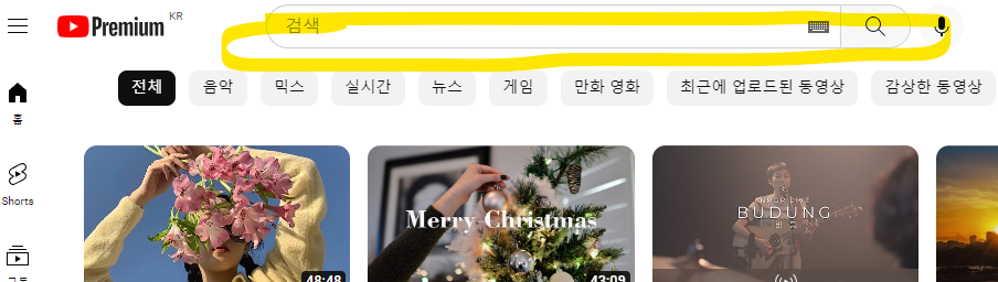
그리고 헤더의 중앙 폼을 만들어줄게요. 검색 창이 될 자리 입니다.
form 태그에 대해서는 여기에 정리된 내용을 같이 참고해주세요.
https://blue-dot.tistory.com/119
웹 HTML 입문 공부 9. form 데이터 전송, fieldset
form은 사용자가 입력한 데이터(입력값)를 서버로 보내기 위해 사용하는 태그입니다. 여기에서 서버란, 정보를 제공하는 호스트(host)를 말합니다. 가령, 우리가 티스토리 홈페이지를 열고자 할 때
blue-dot.tistory.com
검색한 내용을 폼을 통해 서버로 제출하는 역할을 맡아줄 것입니다.
현재 제출할 수 있는 서버가 없기 때문에 return false 을 입력해서 아무것도 반환하지 않도록 하겠습니다.
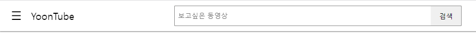
input-text 창 안에는 placeholder로 보고싶은 동영상이 상시 적혀있도록 할게요.
<html>
 <div class="header__center">
        <form class="header__form" onsubmit="return false;">
          <input class="header__input--text" placeholder="보고 싶은 동영상">
          <button class="header__input--button">검색</button>
        </form>
<css>
.header__center{
  width: 50%;
}
.header__form{
  display: flex;
  max-width: 100%;
}
.header__input--text{
  width: calc(100% - 60px);
  height: 40px;
  padding: 0 6px;
  border: 1px solid #8f8f8f;
  border-right: none;
  border-radius: 2px 0 0 2px;
}
.header__input--button{
  width: 60px;
  height: 40px;
  border: 1px solid #8f8f8f;
  border-left: none;
  border-radius: 0 2px 2px 0;
}
이제 헤더의 끝이며, 검색 돋보기 모양과 프로필사진을 삽입합니다.
🔍 는 돋보기 특수모양 코드입니다. 그리고 옆에는 프로필 사진이 걸리게 해줄게요.
<html>
</div>
<div class="header__end">
<button class="header__search">🔍</button>
<div class="header__profile"></div>
</div><css>
.header__end{
  display: flex;
}
.header__search{
  display: none;
  margin-right: 5px;
  border: none;
  background-color: transparent;
  font-size: 1.5rem;
}
.header__profile{
  width: 40px;
  height: 40px;
  border: 1px solid #eaeaea;
  border-radius: 50%;
  background-color: tomato;
  /* background-image: url(../imgs/1.png);
  background-size: 40px 40px; */
}
그리고 이제 미디어 쿼리를 통해 화면이 줄어들면 자연스럽게 아이콘들이 사라져서 축약되는 기능을 넣어줄 거예요.
@media screen and (max-width: 800px){
  .header__title{
    display: none;
  }
}

@media screen and (max-width: 400px){
  .header__center{
    display: none;
  }
  .header__search{
    display: block;
  }
}
스크린 화면이 800보다 작아지면 타이틀인 BEETUBE 가 사라집니다. display:none.
그리고 400보다 작아지면 검색 input 입력 창이 사라지고 대신 돋보기 아이콘이 block으로 드러나게 됩니다.
여기까지가 간단한 구성으로 작성할 헤드에 들어갈 부분의 코드예요.
이 다음에는 왼쪽의 메뉴 부분, 즉 네비게이션 부분을 함께 보겠습니다.
작성한 html 과 css 드들은 아래의 더보기로 두었으니 참고해주세요!
header.css
.header{
  position: fixed;
  top: 0;
  left: 0;
  width: 100%;
  background-color: #fff;
  box-shadow: 0 0 3px #000;
  z-index: 20;
}
.header__wrapper{
  display: flex;
  align-items: center;
  justify-content: space-between;
  height: 60px;
  padding: 0 16px;
}
.header__start{
  height: 40px;
  line-height: 40px;
}
.header__hamburger{
  border: none;
  background-color: transparent;
  font-size: 1.5rem;
}
.header__title{
  font-size: 1.2rem;
  margin-left: 6px;
}

.header__center{
  width: 50%;
}
.header__form{
  display: flex;
  max-width: 100%;
}
.header__input--text{
  width: calc(100% - 60px);
  height: 40px;
  padding: 0 6px;
  border: 1px solid #8f8f8f;
  border-right: none;
  border-radius: 2px 0 0 2px;
}
.header__input--button{
  width: 60px;
  height: 40px;
  border: 1px solid #8f8f8f;
  border-left: none;
  border-radius: 0 2px 2px 0;
}

.header__end{
  display: flex;
}
.header__search{
  display: none;
  margin-right: 5px;
  border: none;
  background-color: transparent;
  font-size: 1.5rem;
}
.header__profile{
  width: 40px;
  height: 40px;
  border: 1px solid #eaeaea;
  border-radius: 50%;
  background-color: tomato;
  /* background-image: url(../imgs/1.png);
  background-size: 40px 40px; */
}

@media screen and (max-width: 800px){
  .header__title{
    display: none;
  }
}

@media screen and (max-width: 400px){
  .header__center{
    display: none;
  }
  .header__search{
    display: block;
  }
}
reset.css
/* http://meyerweb.com/eric/tools/css/reset/
   v2.0 | 20110126
   License: none (public domain)
*/

html, body, div, span, applet, object, iframe,
h1, h2, h3, h4, h5, h6, p, blockquote, pre,
a, abbr, acronym, address, big, cite, code,
del, dfn, em, img, ins, kbd, q, s, samp,
small, strike, strong, sub, sup, tt, var,
b, u, i, center,
dl, dt, dd, ol, ul, li,
fieldset, form, label, legend,
table, caption, tbody, tfoot, thead, tr, th, td,
article, aside, canvas, details, embed,
figure, figcaption, footer, header, hgroup,
menu, nav, output, ruby, section, summary,
time, mark, audio, video {
	margin: 0;
	padding: 0;
	border: 0;
	font-size: 100%;
	font: inherit;
	vertical-align: baseline;
}
/* HTML5 display-role reset for older browsers */
article, aside, details, figcaption, figure,
footer, header, hgroup, menu, nav, section {
	display: block;
}
body {
	line-height: 1;
}
ol, ul {
	list-style: none;
}
blockquote, q {
	quotes: none;
}
blockquote:before, blockquote:after,
q:before, q:after {
	content: '';
	content: none;
}
table {
	border-collapse: collapse;
	border-spacing: 0;
}

/* 개인적으로 조금 더 추가 */
*{
	box-sizing: border-box;
	outline: none;
}
header.html
<!DOCTYPE html>
<html lang="en">
<head>
<meta charset="UTF-8">
<meta http-equiv="X-UA-Compatible" content="IE=edge">
<meta name="viewport" content="width=device-width, initial-scale=1.0">
<title>반응형 컴포넌트</title>
<link href="css/reset.css" rel="stylesheet">
<link href="css/header.css" rel="stylesheet">
</head>
<body>
<header class="header">
<div class="header__wrapper">
<h1 class="header__start">
<button class="header__hamburger">☰</button>
<span class="header__title">BEETube</span>
</h1>
<div class="header__center">
<form class="header__form" onsubmit="return false;">
<input class="header__input--text" placeholder="보고싶은 동영상">
<button class="header__input--button">검색</button>
</form>
</div>
<div class="header__end">
<button class="header__search">🔍</button>
<div class="header__profile"></div>
</div>
</div>
</header>
</body>
</html>'HTML · CSS > HTML · CSS 코드 예제 만들기' 카테고리의 다른 글
| 클론 코딩 1. HTML / CSS 로 카카오톡 화면 구현하기 (1) 디자인 구상하기 (0) | 2022.11.22 |
|---|---|
| Html / CSS 로 유튜브 홈 화면 구현하기 (3) 컨텐츠 창 만들기 (0) | 2022.11.14 |
| Html / CSS 로 유튜브 홈 화면 구현하기 (2) 메뉴 만들기 (0) | 2022.11.14 |
| 웹 HTML 예제 만들기 2. 로그인 폼 만들기 (0) | 2022.11.09 |
| 웹 HTML 예제 만들기 1. 이미지로 하이퍼링크 만들기 (0) | 2022.11.09 |